Why Most Websites Leak Revenue (And What to Do About It)
Conversion optimized websites are websites deliberately designed to turn visitors into customers — using psychology, clear messaging, fast performance, and data-driven testing to remove every barrier between a visitor and a desired action.
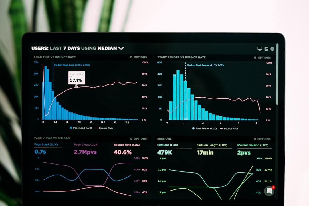
Here is what makes a website conversion-optimized:
- Clear, single call-to-action on each key page
- Fast load times — every second of delay increases bounce rates
- Mobile-first design that works for thumb-friendly navigation
- Benefit-driven copy that speaks to visitor pain points, not company features
- Trust signals — testimonials, reviews, and credibility markers near CTAs
- Minimal friction — short forms, simple checkout, obvious next steps
- Continuous A/B testing to improve based on real data, not guesses
You built the website. You’re running ads, posting on social, maybe even ranking in search. And still — the sales aren’t coming.
This is one of the most common and costly problems for small business owners in 2026. Traffic isn’t the issue. Conversion is.
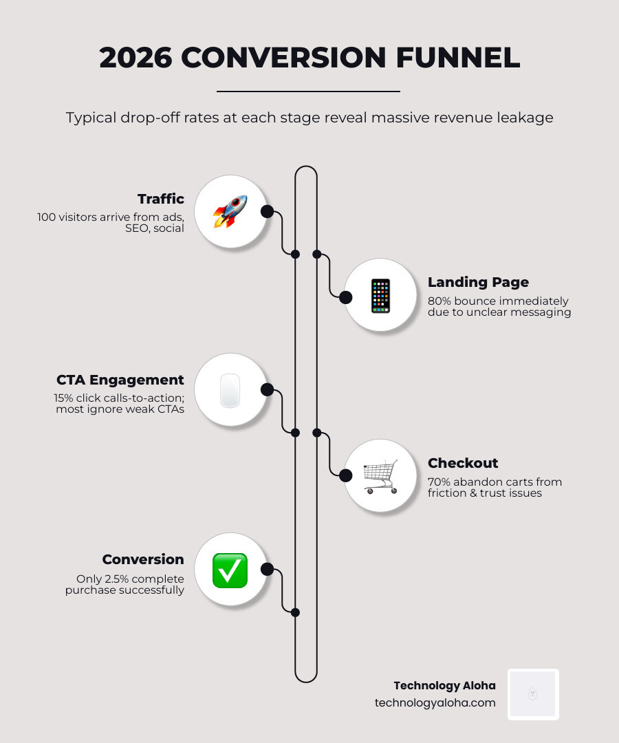
Consider this: the average e-commerce website converts just 2.5% of visitors. That means 97 out of every 100 people who land on your site leave without taking action. Cart abandonment rates hover around 70%. And with traffic costs up significantly, sending visitors to a website that doesn’t convert is, bluntly, burning money.
The hard truth? A beautiful website is not the same as a converting website. Research shows that 75% of visitors decide whether to trust a site based on looks alone — but looks only get you through the door. What keeps people and moves them to act is something deeper: clarity, trust, and a frictionless path forward.
One cautionary case makes the point sharply. A major athletic retailer spent $85 million on a website revamp — and promptly lost $3 million in revenue over Black Friday. A redesign without a conversion strategy is just an expensive decoration.
This guide breaks down exactly why your website may be underperforming — and the specific, proven steps to fix it.
Conversion optimized websites word list:
- best practices for user-centric website design
- user centric design process
- user centric website design
The Core Pillars of Conversion-Optimized Websites
Building conversion optimized websites requires more than just a “Buy Now” button. It requires a structural commitment to the user’s journey. If your site feels like a maze, your visitors will leave before they find the exit—or in this case, the checkout.
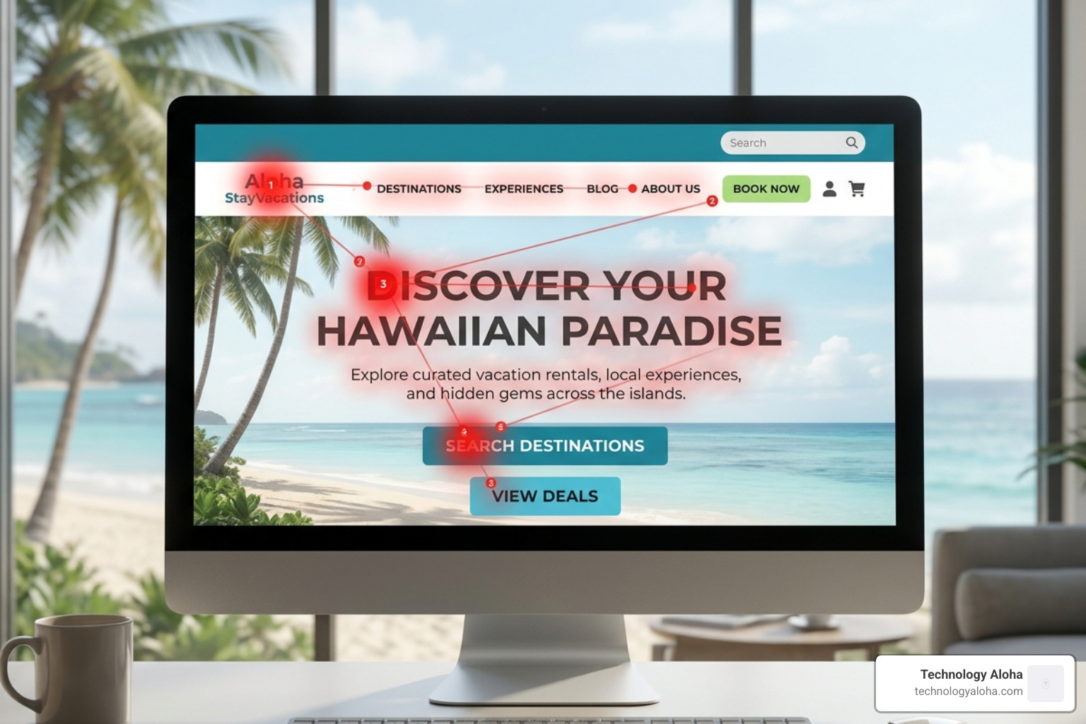
Visual hierarchy is the silent director of your website. It uses size, color, and contrast to tell the visitor’s eyes where to land first. If your primary Call to Action (CTA) is the same color as your navigation bar, it’s invisible. We recommend following The Complete Guide To High Conversion Websites to ensure your layout prioritizes the most important information above the fold.
User Experience and Intuitive Navigation
Confusion is the ultimate conversion killer. When a visitor lands on your page, they ask three questions: Am I in the right place? Can I trust this? What do I do next? If your navigation is cluttered with twenty different links, you’re forcing the user to do too much work. This leads to “decision fatigue,” where the easiest choice for the user is simply to close the tab.
| Feature | Aesthetic-First Design | Conversion-First Design |
|---|---|---|
| Primary Goal | Looking “cool” or trendy | Driving a specific user action |
| Navigation | Complex, hidden, or “creative” | Simple, intuitive, and predictable |
| Imagery | Large, unoptimized stock photos | Purposeful visuals that support copy |
| CTA Placement | Wherever it fits the “look” | Prominent, repeated, and logical |
| Mobile Focus | Secondary thought | Primary focus (Thumb-friendly) |
Mobile responsiveness is no longer a “feature”—it is the baseline. In 2026, the majority of your traffic is likely browsing on a smartphone. If your buttons are too small to tap or your forms require excessive zooming, your conversion rate will plummet. To avoid these pitfalls, learn How To Build A Conversion Focused Web Design That Actually Works.
Psychology and Persuasion: The Science of the “Yes”
Humans like to think we are rational, but most of our purchasing decisions are driven by emotion and subconscious triggers. Conversion optimized websites leverage behavioral economics to make the “Yes” feel natural and safe.
One of the most powerful tools in your arsenal is social proof. People are hesitant to be the first person to try a new service. By placing testimonials, reviews, or “Trusted By” logos near your CTAs, you provide the reassurance needed to click. We detail these strategies in The Art Of High Converting Lead Capture Page Design.
McClelland’s Theory and Human Motivation
To write copy that converts, you must understand what drives your audience. McClelland’s Theory of Needs suggests people are motivated by three things:
- Achievement: The desire to solve a problem or reach a goal.
- Affiliation: The desire to belong to a group or community.
- Power: The desire to have influence or control over their environment.
If you’re selling a productivity app, your copy should focus on Achievement. If you’re selling a luxury membership, focus on Affiliation.
Urgency and scarcity are also vital, provided they are used ethically. A generic countdown timer that resets every time the page refreshes is manipulative and erodes trust. However, a genuine “limited time offer” or “only 3 spots left” creates a “Moment” that protects your profit margins by encouraging immediate action. For a deeper dive into these principles, we highly recommend Influence: The Psychology of Persuasion by Robert Cialdini.
Persuasive Copywriting for Conversion-Optimized Websites
Copywriting is the foundation of CRO. While design gets the visitor to stay, copy gets them to pay.
- Benefit-Driven Headlines: Stop talking about what your product is and start talking about what it does for the customer. Instead of “We Have Advanced Analytics,” try “Make Smarter Decisions with Real-Time Data.”
- The Power of CTAs: The words on your buttons matter. “Submit” is a chore. “Get My Free Guide” is a reward. Check out our guide on Website Call To Action Buttons The Best And Worst Words To Use to see which phrases are currently winning in 2026.
- Micro-copy: These are the tiny bits of text, like the “No credit card required” note under a sign-up button, that address “friction points” and anxieties before they can stop a conversion.
Technical Performance and Friction Removal
You can have the most persuasive copy in the world, but if your site takes six seconds to load, no one will ever read it. Page speed is a direct contributor to your bottom line. Research shows that a 1–5 second delay in load time can increase bounce rates by 90%.
Friction is anything that slows down the user’s progress. Common friction points include:
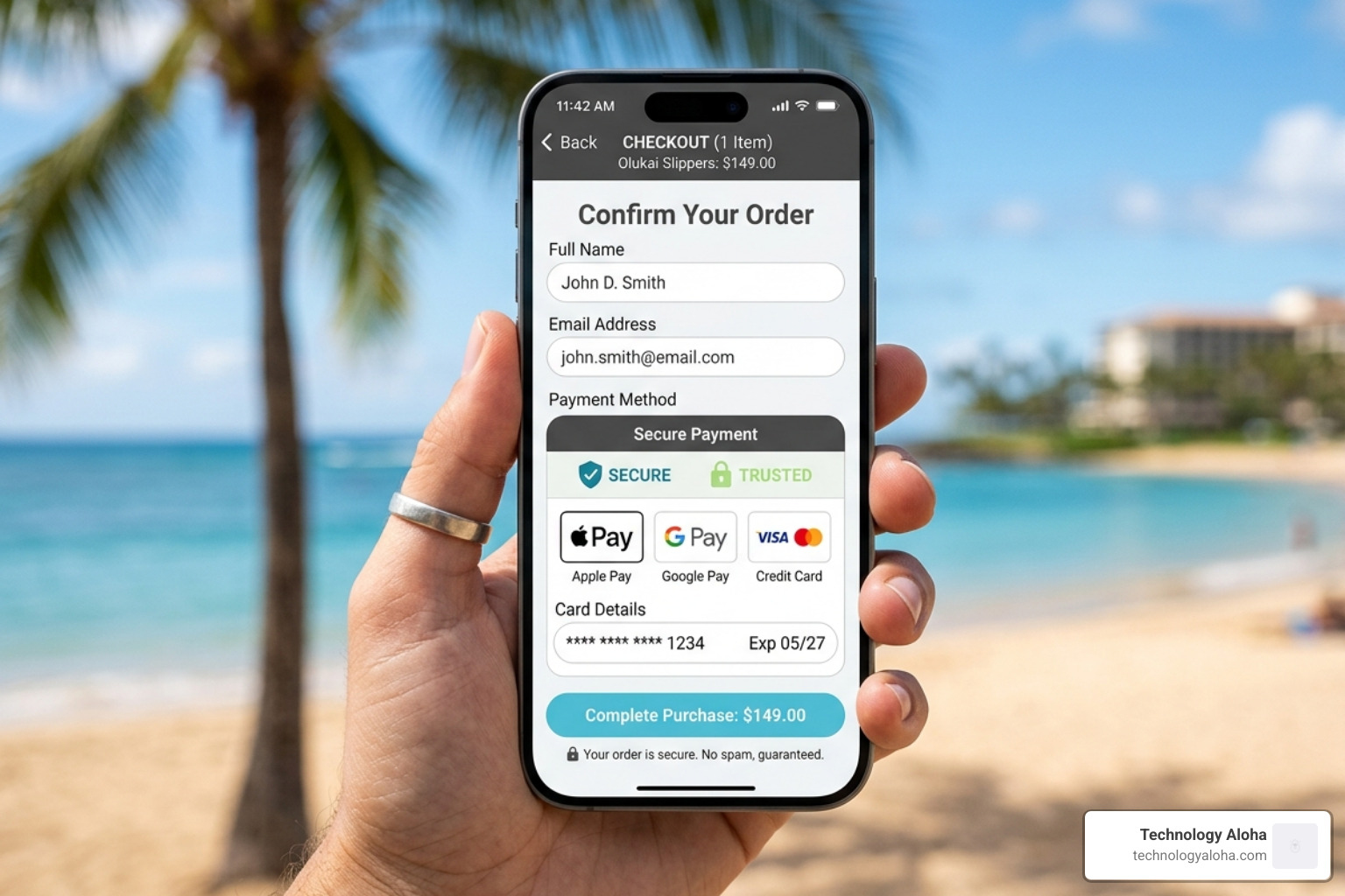
- Excessive Form Fields: Do you really need their middle name and fax number? Every extra field reduces the chance of completion.
- Forced Account Creation: Allow “Guest Checkout” to reduce cart abandonment.
- Hidden Costs: Nothing kills a sale faster than unexpected shipping fees at the very last step.
Technical Performance in Conversion-Optimized Websites
To maintain conversion optimized websites, you must prioritize technical SEO and performance. This includes optimizing images with modern formats (like WebP), leveraging browser caching, and ensuring your site meets the latest accessibility standards.
When building your product pages, remember to include the 4 Things You Need To Include On Your Product Pages to ensure technical clarity. If you’re looking for quick wins, start with these Increase Your Websites Conversions With These 5 Tips.
We also use data-driven insights to identify where users are dropping off. By learning How To Build Pages That Convert Using Real Data, you can stop guessing what’s wrong and start fixing what’s broken.
Data-Driven Iteration and Continuous Improvement
The biggest mistake a business owner can make is treating a website like a “one-and-done” project. Conversion optimized websites are living experiments. What worked in 2024 might not work in 2026 because user behavior evolves.
A/B testing (or split testing) is the process of showing two versions of a page to different visitors to see which one performs better. You might test:
- Two different headlines.
- The color of your CTA button (e.g., #208a9d vs. #50c6db).
- The placement of social proof.
Beyond A/B testing, tools like heatmaps and session recordings allow us to see exactly where users are clicking—and where they are getting stuck. If a heatmap shows that everyone is clicking on an image that isn’t a link, that’s a clear signal that your design is confusing your audience.
If you find this process overwhelming, you aren’t alone. Many businesses partner with experts to manage this ongoing cycle. You can find more information in The Insider Guide To Conversion Rate Optimization Agencies. Using Google Analytics 4 (GA4) and heuristic analysis, we can build a feedback loop that consistently improves your ROI.
Frequently Asked Questions about Website Conversions
How long does it take to see results from CRO?
While some technical fixes (like improving page speed) can show immediate results in bounce rates, true conversion rate optimization is a marathon. We typically look for a 90-day benchmark to gather enough statistically significant data. For low-traffic sites, it may take longer to reach a “winner” in an A/B test, but the insights gained are always valuable for long-term growth.
What is a “good” conversion rate in 2026?
The “average” is 2.5%, but “good” depends entirely on your industry and your goals. A high-ticket B2B service might be thrilled with a 1% conversion rate if those leads are high-quality. An e-commerce store selling $20 items might need a 5% rate to be profitable. Instead of chasing universal benchmarks, focus on personal growth—aim to beat your own numbers month-over-month.
Can I optimize my site without a full redesign?
Absolutely. In fact, we often recommend starting with “high-impact tweaks” before committing to a total overhaul. Shifting your CTA placement, rewriting your hero section copy, and compressing your images can yield significant lifts without the $85 million price tag. Small, data-backed changes are often more effective than a “pretty” redesign that hasn’t been tested.
Conclusion
At Technology Aloha, we believe that your website should be your hardest-working employee. We specialize in blending data-driven insights with cohesive branding to create conversion optimized websites that don’t just look good—they perform.
Whether you are based in Kahului, Maui, or elsewhere in Hawaii, your business deserves a digital presence that turns clicks into customers. By focusing on the pillars of UX, psychology, and technical performance, you can stop the revenue leaks and start scaling.
Ready to transform your site? Let’s focus on Crafting Cohesive Digital Experiences That Actually Convert.
For More info about our conversion services, visit us today and let’s start building your conversion machine.