Why High Engagement Landing Designs Are Your Most Valuable Conversion Asset
High engagement landing designs are standalone web pages built around a single goal — turning a visitor into a lead, subscriber, or buyer.
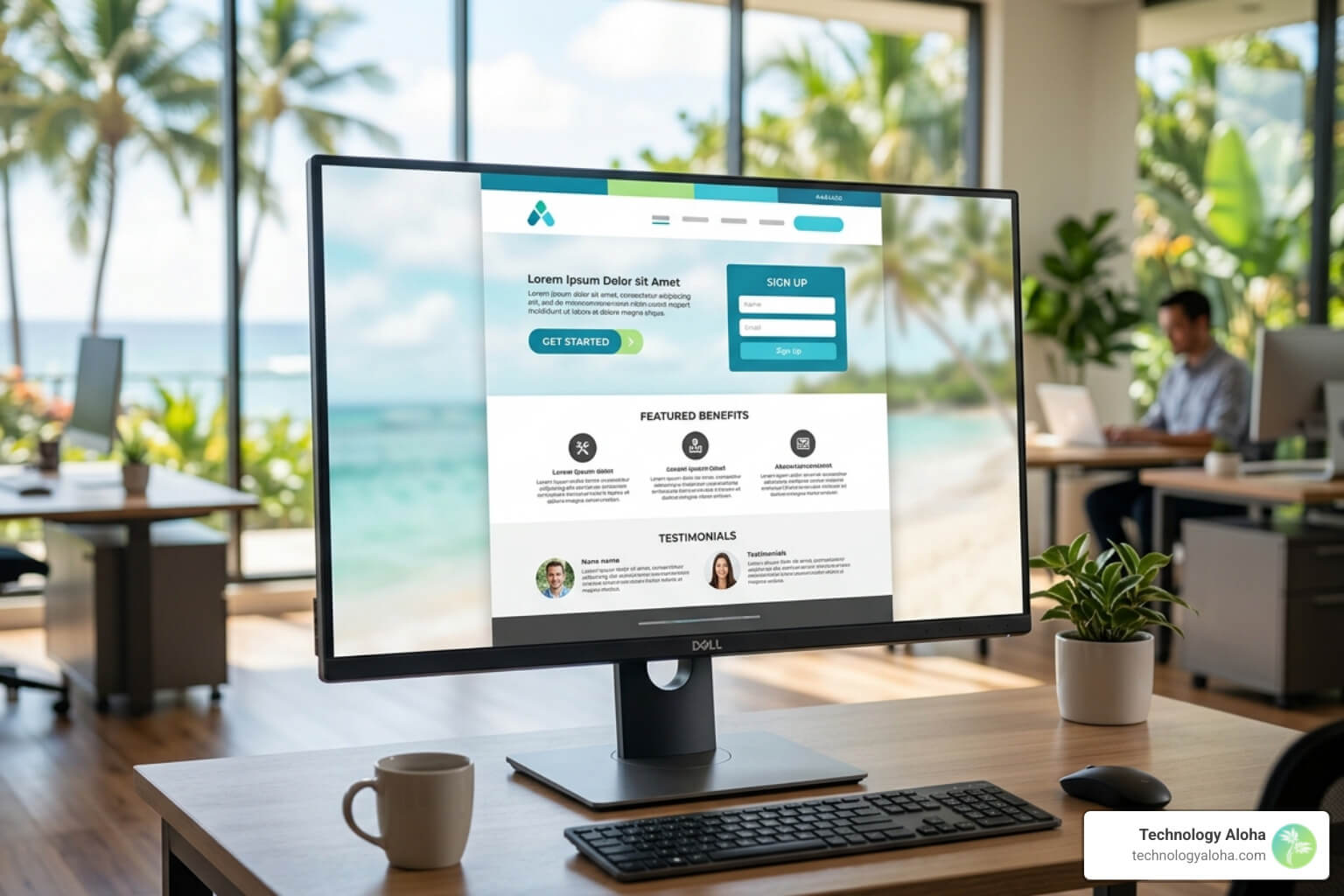
Here’s what makes them work:
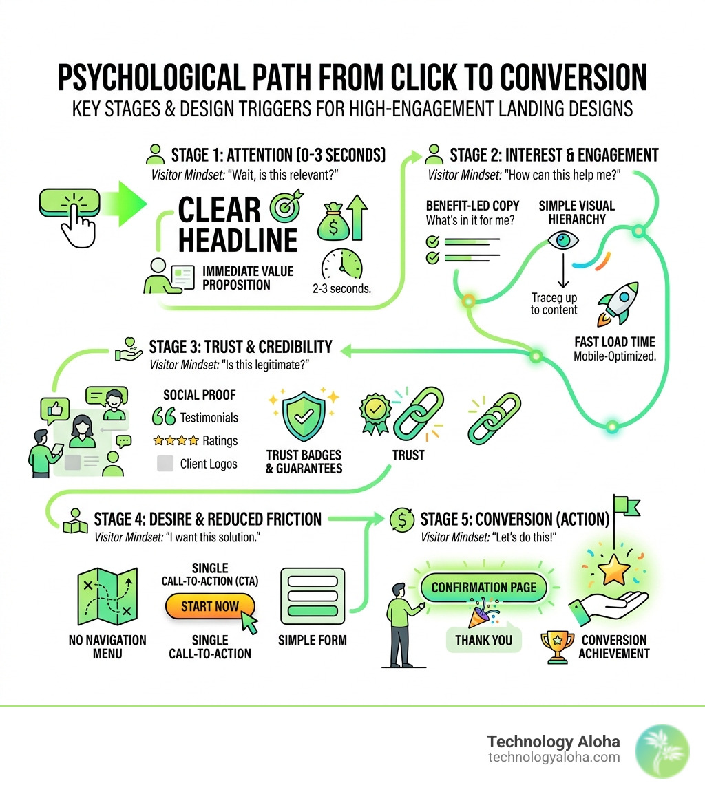
- Clear headline — communicates value within 2–3 seconds
- Single call-to-action (CTA) — one focused action, no competing choices
- Social proof — testimonials, stats, or logos that build instant trust
- Benefit-led copy — answers “what’s in it for me?” before anything else
- No navigation menu — removes exit paths and keeps visitors focused
- Visual hierarchy — guides the eye from headline to CTA naturally
- Fast load time — under 2 seconds, especially on mobile
Most small business websites bleed traffic quietly. Visitors arrive, feel confused or unconvinced, and leave — often within 10 seconds. Research consistently shows that the average landing page converts at just 2.35%, but the top 25% convert at 5.31% or higher. The gap between those numbers isn’t luck. It’s design.
The problem isn’t traffic. It’s what happens after the click.
A homepage is built to inform. A landing page is built to convert. When you send ad traffic or email clicks to a homepage cluttered with navigation, multiple offers, and competing messages, you’re fighting the attention economy — and losing. Landing pages that focus on one message, one offer, and one action consistently outperform general web pages because they remove friction and match visitor intent.
The 2.6-second rule matters here: that’s roughly how long a visitor takes to decide if your page is worth their time. If your value proposition isn’t obvious in that window, they’re gone.
High engagement landing designs helpful reading:
- Stop Being Boring with High-Impact Digital Ads
- Why Your Business Needs a High-Performance Digital Strategy
- The Ultimate Blueprint for High-Performance Website Builds
The Anatomy of High Engagement Landing Designs
A high-performing landing page isn’t an art project; it’s an engineering feat. Every pixel must justify its existence by contributing to the user’s journey toward the “Most Wanted Action” (MWA). At Technology Aloha, we view the landing page as a conversion engine where the structure dictates the results.
The Hero Section: Your First and Last Chance
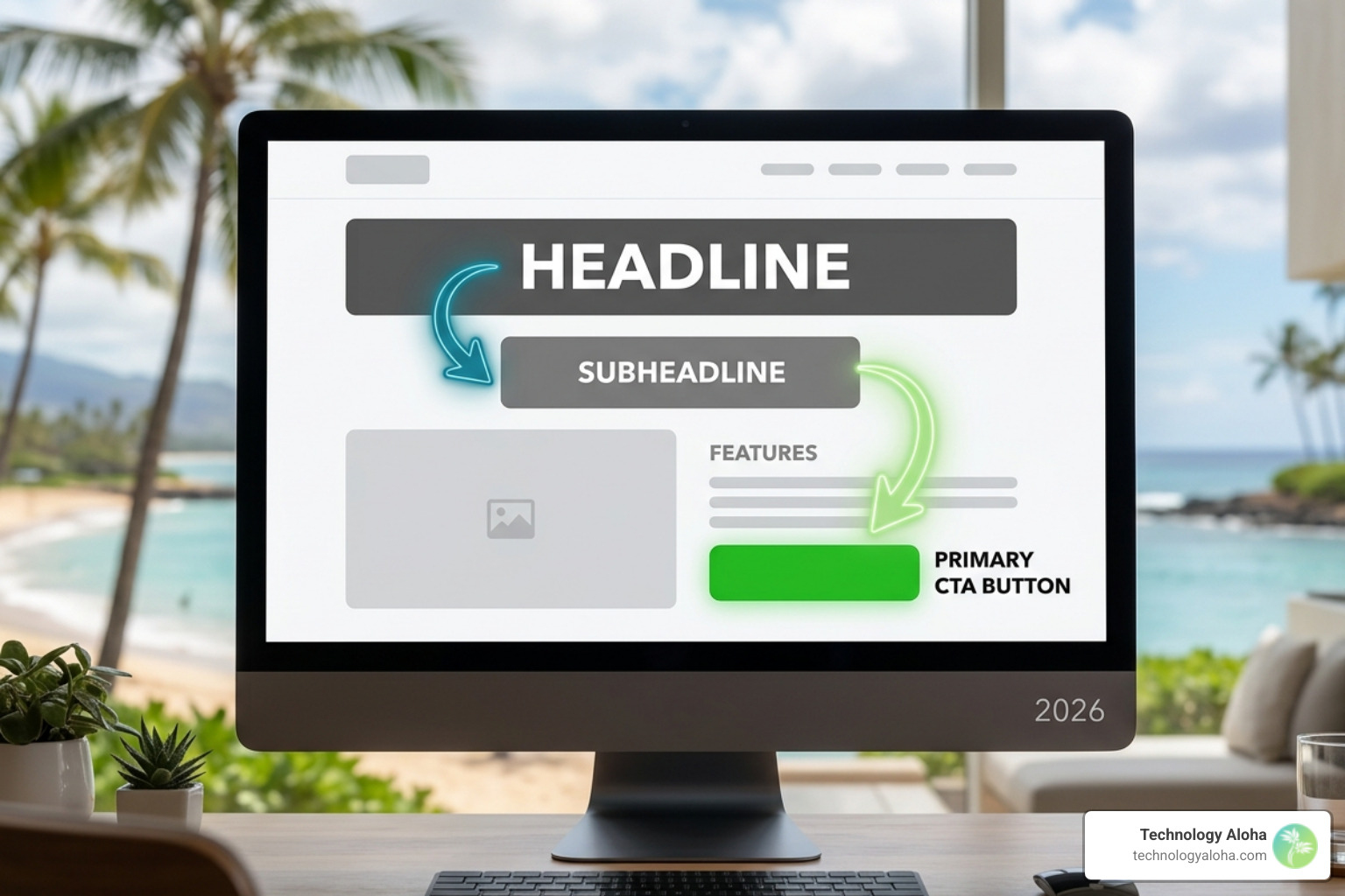
The hero section — the area visible without scrolling — carries 70% of the conversion weight. It must answer three questions instantly:
- What is this?
- What’s in it for me?
- What do I do next?
A benefit-led headline is the cornerstone of this section. Instead of saying “We Offer Marketing Services,” a high-engagement headline says “Double Your Lead Volume in 90 Days Without Increasing Your Ad Spend.” Specificity wins every time. Pair this with a subheadline that clarifies the “how” and a primary CTA that stands out through color contrast.
For a deeper dive into capturing leads effectively, see The Art of High-Converting Lead Capture Page Design.
Content Length: The Rational vs. Emotional Balance
How much copy is too much? The answer depends on the “ask.” If you are asking for an email address in exchange for a free checklist, keep it brief. If you are selling a high-ticket consulting package, your visitors need more evidence to overcome their skepticism.
| Offer Type | Copy Length | Goal |
|---|---|---|
| Free/Low Cost | Short-form (<350 words) | Minimize friction, maximize speed |
| Complex/Expensive | Long-form (1,000+ words) | Answer objections, build deep trust |
| Financial Services | Ultra-short (<200 words) | Directness and perceived security |
| Media/Entertainment | Short-form | Visual-heavy, low cognitive load |
Visual Patterns and Scanning Habits
In 2026, we know that users do not read; they scan.
- Z-Pattern: Ideal for pages with minimal content. The eye moves from the top left (logo) to the top right (CTA), then down to the bottom left (visual), and finally to the bottom right (secondary CTA).
- F-Pattern: Common for text-heavy pages. Users scan the top horizontally, then move down and scan shorter horizontal lines.
By placing your most critical information — like power stats or your primary value proposition — along these paths, you ensure they aren’t missed. Use white space generously to prevent “visual claustrophobia,” which causes visitors to bounce.
Why Clarity Trumps Creativity in High Engagement Landing Designs
Designers often fall into the trap of “creativity for creativity’s sake.” While a beautiful page is nice, a clear page is profitable. This is the principle of cognitive fluency: people prefer things that are easy to think about.
Message Match If your ad promises “Maui Proposal Packages” and the landing page talks generally about “Photography Services,” you’ve broken the chain of trust. The headline on your landing page should mirror the copy in your ad. This continuity reduces the “bounce” caused by confusion. For example, a specialized page like Maui Proposal Packages – Create Your Dream Proposal In Maui, HI works because it delivers exactly what the user expected when they clicked.
Hick’s Law and Choice Paradox Hick’s Law states that the time it takes to make a decision increases with the number and complexity of choices. In high engagement landing designs, we eliminate the navigation menu entirely. Every link that isn’t your primary CTA is a “leak” where your conversion rate drains away. A single-goal focus can increase conversions by up to 371%.
To learn more about building this type of focus, explore How to Build a Conversion-Focused Web Design That Actually Works.
Leveraging Social Proof for High Engagement Landing Designs
Trust is the currency of the internet. In an era of AI-generated content and deepfakes, visitors are more skeptical than ever. They don’t want to hear what you say about yourself; they want to hear what others say about you.
- Power Stats: “Joined by 10,000+ educators” or “500+ 5-star reviews.”
- Logic Strips: A row of client logos placed immediately under the hero section.
- Testimonials: Place these within 200 pixels of your CTA buttons. When a user is about to click, they need a final nudge of reassurance.
- Quantified Results: Instead of “They helped us grow,” use “They increased our trial-to-paid conversion by 30% in 90 days.”
Visual evidence also plays a massive role. Landing pages with video can increase conversions by 86%. Whether it’s a product demo or a video testimonial, seeing is believing. You can see examples of visual storytelling in engagement-focused niches here: Recent Favorite Engagement Images from Tad Craig Photography.
A 5-Step Process for Building High-Performance Pages
Designing a landing page without a process is just guessing. We follow a data-driven blueprint to ensure every page is built on a foundation of user intent.
- Identify the Audience & Their Problem: Who is clicking? Are they a stressed-out bride-to-be looking for Places to Propose & Engagement Ideas in Hawaii or a B2B executive trying to lower their CAC?
- Define the Most Wanted Action (MWA): What is the one thing you want them to do? Buy now? Schedule a call? Download a guide?
- Build the Hypothesis: “If we show the dashboard interface (Visual) and highlight the 1-day setup (Benefit), then more users will start a free trial (MWA).”
- Wireframe the Layout: Map out the visual hierarchy. Place the headline, social proof, and CTA in a logical sequence that builds momentum. This is where Mastering the User-Centric Design Process becomes essential.
- Assemble and Test: Build the page quickly, then run A/B tests on your headline and CTA color.
Advanced Engagement Tactics for 2026
The landscape of high engagement landing designs has shifted. In 2026, static pages are being replaced by dynamic, personalized experiences.
AI-Driven Personalization
Modern landing pages use edge computing to adapt in real-time. If a visitor arrives from a LinkedIn ad, the page might emphasize professional networking benefits. If they come from a local search in Kahului, the page might highlight Hawaii-specific success stories. Personalization isn’t just a “nice to have”; companies excelling at it generate 40% more revenue.
Bento Grid Layouts
The “Bento Box” grid is the design trend of 2026. It replaces traditional long lists of features with a structured, visually appealing grid of cards. This layout is excellent for mobile-first design as it stacks perfectly and allows for micro-animations that respond to user scrolls.
Answer Engine Optimization (AEO)
With the rise of AI search, your landing page needs to be readable by both humans and machines. Using semantic HTML5 (like , and ) and structured data (Schema.org) ensures that AI agents can accurately pull your “power stats” and value propositions into search answers.
Interactive Elements
Static forms are dying. Multi-step quizzes or interactive calculators increase engagement by making the user an active participant. For example, a quiz that asks “What’s your photography style?” before showing Oahu’s Best Places to Propose: Hawaii Engagement Planner & Ideas builds rapport and reduces the “ask” friction.
Keep up with these shifts by reading The Top-Converting Web Design Trends Your Site Should Invest In.
Frequently Asked Questions about Conversion Design
How long should a landing page be in 2026?
The “fold” is a myth, but attention spans are real. Your page should be exactly as long as it needs to be to answer the visitor’s questions and no longer.
- Use short copy for “impulse” or low-friction actions (e.g., newsletter signups).
- Use long copy for “rational” purchases that require a significant investment of time or money. If you’re wondering what to include in a condensed format, see What a Single Page Website Should Include.
Why should I avoid sending ad traffic to my homepage?
Sending ad traffic to a homepage is like inviting someone to a party and then asking them to do their own laundry. There are too many distractions. A homepage typically has 10–20 different links, each one a potential exit point. A dedicated landing page has one. By matching the specific intent of the ad to a specific page, you lower your bounce rate and maximize your ROI.
For more tips on stopping the “leak,” read Increase Your Website’s Conversions with These 5 Tips.
What are the best CTA words to drive action?
Vague words like “Submit” or “Click Here” are conversion killers. The best CTAs are benefit-oriented and often written in the first person.
- Bad: “Download”
- Good: “Get My Free Growth Audit”
- Bad: “Contact Us”
- Good: “Schedule My 15-Minute Consult”
High-contrast colors (like a bright #abe080 button on a dark #4d4d4d background) ensure the button is the most obvious thing on the page. Learn more about the psychology of buttons in Website Call-to-Action Buttons: The Best and Worst Words to Use.
Conclusion
At Technology Aloha, we believe that your landing page is the “welcome mat” to your business. It is the bridge between a stranger’s curiosity and a customer’s commitment. By combining strategic positioning with data-driven high engagement landing designs, we help businesses in Hawaii and beyond turn their digital presence into a lead-generation machine.
Building a high-converting page isn’t about being the loudest in the room; it’s about being the clearest. When you remove the noise, provide the proof, and lead with a generous value proposition, conversion compounding happens naturally.
Ready to transform your traffic into revenue? Start by mastering the fundamentals in The Complete Guide to High-Conversion Websites.