Why Effective Nonprofit Websites Matter in 2026
Nonprofit websites work when they quickly explain the mission, show credible proof of impact, and make the next step obvious – whether a visitor wants to donate, volunteer, get help, or learn more.

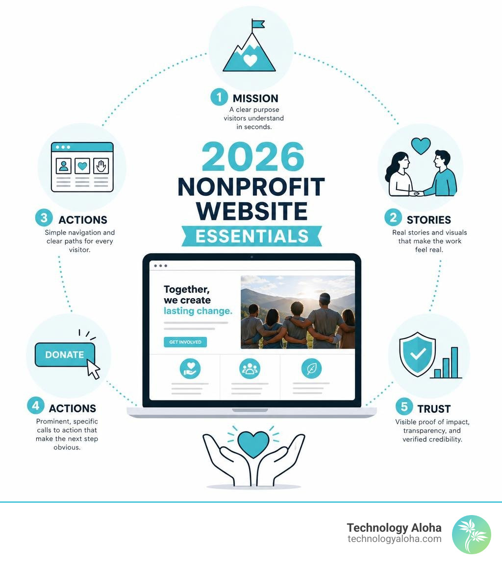
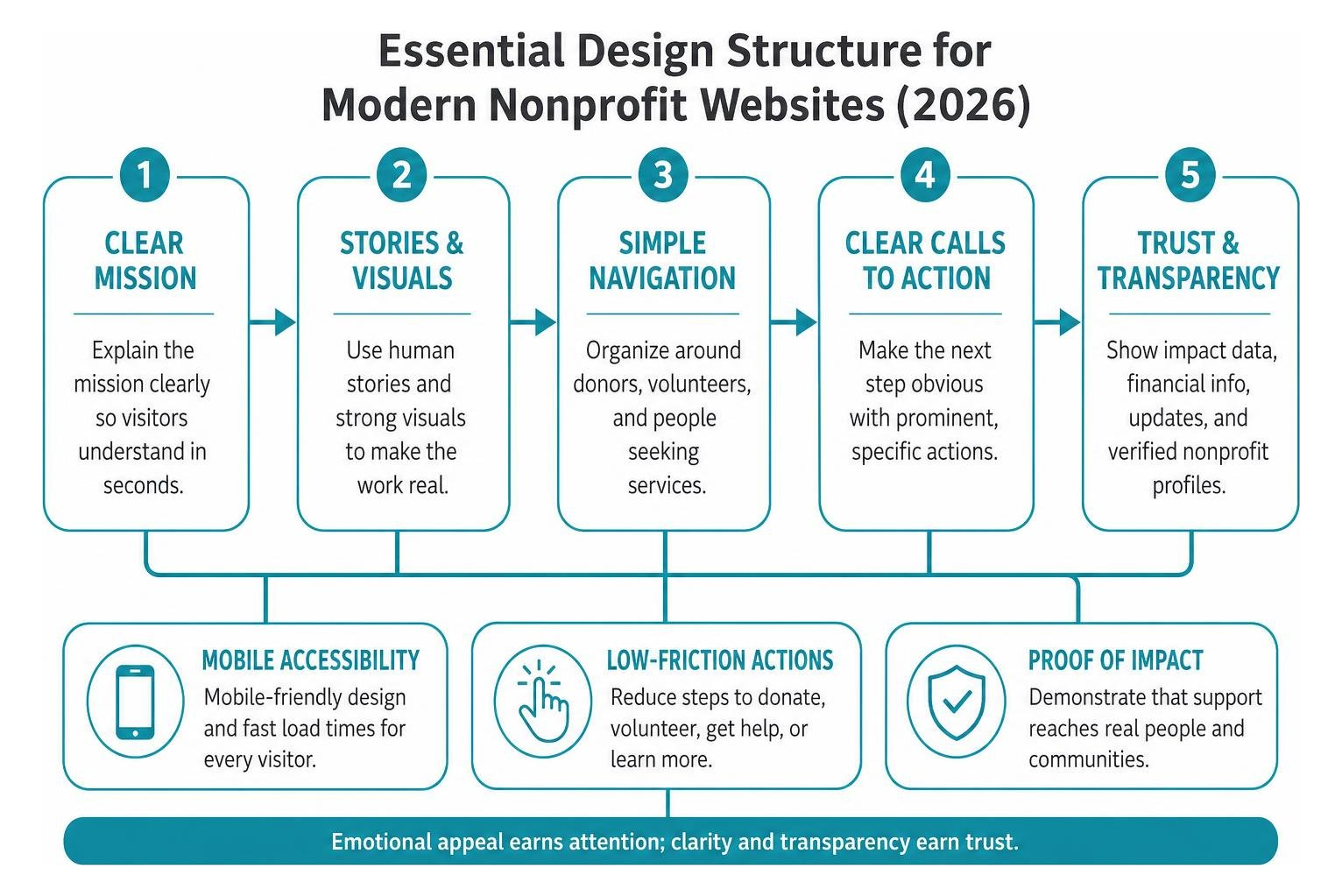
The strongest sites usually share these essentials:
- A clear mission visitors can understand in seconds.
- Human stories and strong visuals that make the work feel real.
- Simple navigation built around the needs of donors, volunteers, and people seeking services.
- Prominent, specific calls to action such as “Donate,” “Find Food,” or “Volunteer.”
- Visible trust signals – impact data, financial details, program updates, and verified nonprofit profiles.
A beautiful homepage is not enough. A nonprofit website must also reduce the work required to take action. That means a mobile-friendly donation path, easy-to-find service information, and proof that support reaches real people and communities.
Leading organizations show how this can work at scale. For example, charity: water publishes project counts and verification details, while Doctors Without Borders clearly reports how funds are allocated. The lesson is simple: emotional appeal earns attention; clarity and transparency earn trust.
This guide examines nonprofit website examples for 2026 and the practical patterns behind them – from storytelling and accessibility to donation journeys and impact reporting.
Essential Features of Top-Performing Nonprofit Websites in 2026
When someone lands on your homepage, you have about three seconds to capture their interest before they click away. That means top-performing nonprofit websites must combine intuitive design with technical reliability. In 2026, visitors expect the exact same seamless experience from a charitable organization that they get from modern e-commerce platforms.
To bridge the gap between initial curiosity and real support, high-converting platforms integrate specialized donation tools into their architecture, as discussed in Nonprofit Donation Tools: Why You Need One. Every element—from color contrast to page load speed—should guide the user toward meaningful action without friction.
Clear Mission Clarity and Distinct Brand Identity
Your mission statement cannot afford to hide behind vague industry jargon or long, academic paragraphs. Top organizations state their core purpose high on the homepage in direct, clear language. When visitors instantly understand whom you serve and what problem you solve, they feel confident sticking around.
Following the principles in A Clear Branding Strategy Is What Every Nonprofit Needs ensures that your typography, visual palette, and voice reflect your work’s heart. Warm palettes and high-contrast typography give organizations an approachable, authentic presence while establishing authority.
Frictionless Donation Journeys and Contextual Calls to Action
If a donor decides to give, any delay or confusion in the payment process can cause them to abandon the form entirely. Modern websites feature streamlined donation flows with pre-set giving amounts tied to real-world outcomes (for example, “$25 provides 50 meals”).
Applying strategies from How to Create Donation Forms: 7 Methods That Guarantee Results involves minimizing required fields, offering digital wallet options, and embedding contextual calls to action (CTAs) alongside inspiring story updates across the site.
Storytelling and UX Strategies That Drive Donor Conversion
While data and statistics demonstrate efficiency, human stories create the emotional connection that inspires people to give. Digital user experience (UX) design in 2026 focuses on weaving storytelling elements seamlessly into the site navigation.
By pairing short recipient narratives with dynamic micro-interactions, organizations turn passive readers into active partners. Mastering the concepts in Powerful and Important Storytelling for Nonprofits means moving past generic statements to highlight individual journeys and real community impact.
Interactive Features in Modern Nonprofit Websites
Modern web platforms use subtle interactive elements to make complex topics engaging. Highlighting features like split-screen scrolling, interactive project maps, and light visual effects turns browsing into an active experience.
These features help apply strategies from Get Millennials Donating to Charity by creating hands-on touchpoints—such as dragging a slider to see how a regional watershed improves over time or hovering over interactive project locations to read personal community updates.
Building Trust Through Financial Transparency and Impact Data
Donors want complete certainty that their contributions make a real difference. Incorporating quantitative impact metrics—like project counters or percentages—builds immediate institutional authority.
To prevent churn, applying Donor Retention: 5 Reasons Donors Stop Giving and How to Fix It requires showing exactly where every dollar goes. Highlighting verified Candid (GuideStar) Seals of Transparency, direct IRS 990 documentation, and independent financial audits shows supporters that your organization operates with total integrity.
Lessons from World-Class Non-Profit Digital Strategies

Global nonprofit leaders offer valuable lessons for organizations of any size. By examining how world-class charities organize complex content, present real-time impact, and streamline donation pathways, we can apply those exact strategies locally.
| Organization | Key Strategy Highlight | Impact Metric Shown | Core UX takeaway |
|---|---|---|---|
| charity: water | 100% public model with GPS tracking | 209,241+ water projects funded | Radical transparency through proof of work builds instant donor confidence |
| Doctors Without Borders | Immediate crisis alerts paired with fund breakdowns | 17M+ medical consultations | Direct financial breakdowns – 84% to field programs overcome giving hesitation |
| WWF | Symbolic adoptions and supply chain advocacy | 83% direct conservation allocation | Contextual giving tied directly to species and ecosystem protection |
| Habitat for Humanity | Time-sensitive matching banners and DIY content | 65M+ people helped globally | Dual engagement pathways combine urgent appeals with community lifestyle tips |
Clean Water and Humanitarian Case Studies: charity: water and Doctors Without Borders
charity: water sets a gold standard for transparency by showing dynamic project counters and assigning GPS coordinates and photos to every completed water project. Their unique 100% funding model – where private donors cover operational expenses so 100% of public gifts fund clean water – is clearly displayed across their donation funnels.
Similarly, Doctors Without Borders communicates urgent medical needs with total clarity. Their platform features real-time field news alongside an explicit financial breakdown: 84% of funds go directly to emergency care programs, 15% to fundraising, and just 1% to administration. This clear transparency assures donors that their financial support directly saves lives on the ground.
Conservation and Housing Case Studies: WWF and Habitat for Humanity
WWF excels at converting visual engagement into conservation funding. By offering symbolic species adoptions and highlighting that 83% of donations fund direct conservation work, they connect environmental passion with actionable support.
Meanwhile, Habitat for Humanity demonstrates how to engage regional and global audiences simultaneously. Having helped over 65 million people build or improve shelter over the past 50 years, their platform uses time-sensitive matching gift banners, localized chapter locators, and practical DIY content to turn everyday website visitors into lifelong volunteers and donors.
Designing Inclusive Digital Platforms for Diverse Audiences
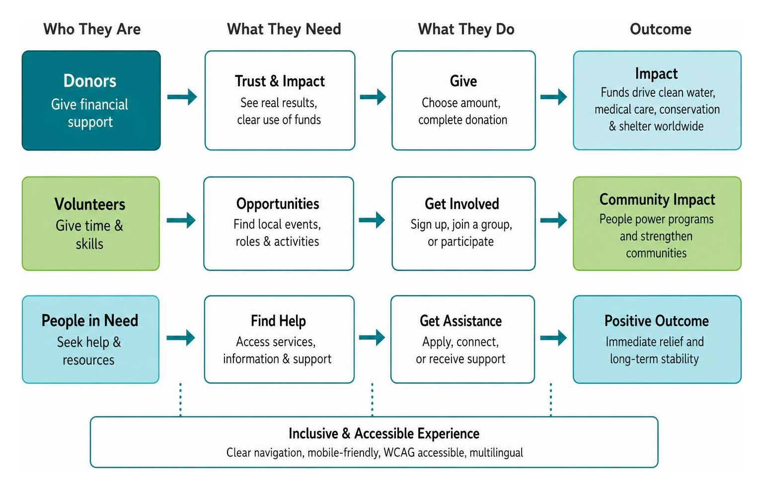
An effective digital presence must serve multiple audiences at once. A single homepage often needs to welcome financial donors, guide volunteers toward local events, and provide immediate, dignified assistance to community members in need.
To serve everyone effectively, platforms must meet modern WCAG accessibility guidelines. This includes maintaining strong color contrast ratios, offering simple screen-reader navigation, and providing clear multilingual options. Accessible design ensures that everyone—regardless of ability or technical literacy—can access your resources.
Budget-Friendly Strategies for Small Nonprofit Websites
Small non-profits often struggle with limited resources, but you do not need a massive budget to build a powerful web presence. Taking advantage of in-kind programs like Google Ad Grants can provide eligible nonprofits with up to $10,000 per month in search advertising to drive targeted traffic.
Understanding principles from Why Your Nonprofit Needs Millennial Volunteers can help expand your reach organically through digital advocacy and social sharing. Small organizations can use 3 Free Tools for Your Nonprofit to Start Using Today to streamline operations, while learning strategies from How Using Google Grants Helps Your Nonprofit Reach New Heights drives consistent traffic without draining your budget.
Website Security and Performance Optimization
Donor security and site speed are essential for keeping supporters engaged. Research on mobile page speed and bounce probability shows that even short delays can reduce user engagement, especially on mobile devices.
Following Simple Secure Website Tips for Nonprofits protects sensitive supporter data with updated SSL encryption, secure payment gateways, and routine database backups. Protecting donor privacy builds long-term organizational credibility and trust.
Frequently Asked Questions About Nonprofit Websites
How do nonprofit websites turn one-time visitors into recurring donors?
Converting one-time visitors into recurring monthly supporters relies on clear communication, low-barrier giving options, and consistent follow-up. Prominently featuring a monthly giving option alongside clear impact statements (such as “$20/month feeds a family every week”) helps donors visualize their ongoing role in your mission.
Implementing automated, personalized onboarding emails using strategies from How Email Marketing Can Convert One-Time Donors into Recurring Supporters keeps supporters updated on program milestones and deepens their connection over time.
What are the most effective digital trends for nonprofit websites in 2026?
The most effective digital trends in 2026 focus on creating authentic, human-centered experiences. Key trends include tactile visual design elements—like warm color palettes and hand-drawn illustrations—paired with interactive project mapping and short-form video updates.
Applying these modern approaches from 6 Ways to Reach Donors in a Digital World helps organizations stand out, keep visitors engaged, and build deeper relationships with their community.
How can small nonprofits optimize their websites on a tight budget?
Small organizations can maximize their digital impact by focusing on clarity, ease of use, and local community stories rather than overly complex features. Keeping site navigation simple and ensuring donation forms are mobile-friendly removes unnecessary friction for potential supporters.
Applying practical advice from 5 Digital Marketing Tips for Nonprofits Just Starting Out allows smaller organizations to build a strong digital footprint, reach local supporters, and grow their community impact sustainably.
Conclusion
Building a successful digital presence requires balancing clear mission messaging, authentic emotional storytelling, and reliable, high-performing technical design. By removing friction from the donation journey, showing transparent impact data, and ensuring accessible navigation for all users, your platform turns curious visitors into dedicated, long-term partners.
A high-converting nonprofit web design foundation gives organizations the structure they need to expand reach, improve donor engagement, and support lasting community impact in 2026 and beyond.