What Are the 7 Principles of Conversion-Centered Design?

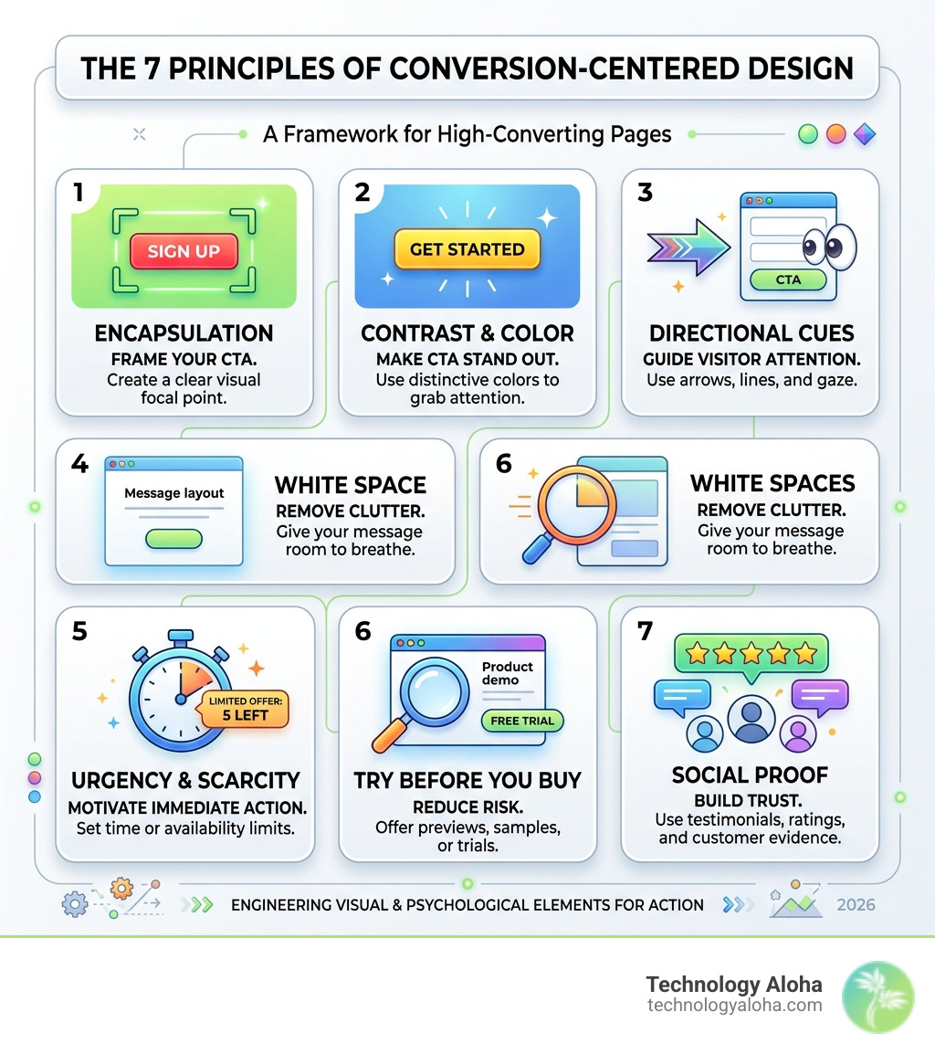
The 7 principles of conversion-centered design are a framework for building web pages that focus every visual and psychological element on one goal: getting visitors to take action.
Here they are at a glance:
- Encapsulation — Frame your CTA to create a visual focal point
- Contrast and Color — Make your CTA stand out from everything else on the page
- Directional Cues — Use arrows, eye gaze, and pathways to guide attention
- White Space — Remove clutter so your key message gets room to breathe
- Urgency and Scarcity — Motivate immediate action through time or availability limits
- Try Before You Buy — Reduce risk with previews, samples, or free trials
- Social Proof — Build trust with testimonials, ratings, and real customer evidence
Most websites try to do too many things at once. They have navigation menus, social links, pop-ups, multiple offers, and a dozen places to click. The result? Visitors get confused and leave.
Conversion-Centered Design (CCD) is a different approach. The core argument is simple: every element on a page should serve one singular goal.
That is the key distinction between CCD and traditional UX design. Standard UX focuses on usability and broad user satisfaction across an entire site. CCD focuses on a single, measurable conversion — a click, a sign-up, a purchase — and engineers the entire page experience around that outcome.
For small business owners competing in crowded markets, that difference is everything.
Common 7 principles of conversion-centered design resources:
- The Insider Guide to Conversion Rate Optimization Agencies
- The Art of High-Converting Lead Capture Page Design
The Core Psychology of the 7 Principles of Conversion-Centered Design
At the heart of the 7 principles of conversion-centered design is a metric called the Attention Ratio. This is the ratio of things a visitor can do on a page versus the one thing they should do. On a standard homepage, this ratio might be 40:1. On a high-converting landing page, it must be 1:1.
Research into over 20,000 lead generation pages shows a direct correlation: the more links a page has, the lower the conversion rate. When we reduce options, we eliminate “analysis paralysis”—the psychological state where having too many choices leads to making no choice at all. A famous “Jam Study” by psychologist Sheena Iyengar illustrated this perfectly: 30% of customers purchased jam when offered 6 varieties, but only 3% purchased when faced with 24 options.
Human brains process visual information up to 60,000 times faster than text. This is why The Seven Simple Principles of Conversion Centred Design (CCD) and How to Use Them relies so heavily on visual hierarchy. If your page layout doesn’t immediately signal where the eye should land, you’ve already lost the visitor’s interest. The Art Of High Converting Lead Capture Page Design requires us to respect the visitor’s limited time by providing a singular, unobstructed path forward.
| Feature | Standard Web Page | CCD Landing Page |
|---|---|---|
| Attention Ratio | High (40:1 or more) | Ideal (1:1) |
| Primary Goal | Exploration/Information | Specific Conversion |
| Navigation | Full Menu/Social Links | None (or very limited) |
| Visual Flow | Dispersed | Guided to CTA |
| Psychology | General Interest | Urgency & Trust |
Visual Cues: Directing the Digital Eye
Principle 1: Encapsulation and the 7 principles of conversion-centered design
Encapsulation is the practice of “wrapping” your primary call to action (CTA) or lead form to create a tunnel vision effect. By using containers, borders, or contrasting background boxes, we carve out a clear focal point that stands out from the visual noise.
Think of it like a spotlight on a stage. How To Build A Conversion Focused Web Design That Actually Works involves using these boxes to tell the user exactly where the most important information lives. When we encapsulate a form, we signal that this specific area is the gateway to the offer, reducing the cognitive load required to find the “next step.”
Principle 2: Contrast and Color
Color is a powerful tool, but in CCD, contrast is king. To make a CTA standout, it must “pop” against the rest of the page. This is often achieved through the Von Restorff effect (also known as the isolation effect), which predicts that when multiple similar objects are present, the one that differs from the rest is most likely to be remembered.
For example, if your brand colors are primarily shades of blue, a vibrant orange button will command immediate attention. Website Call To Action Buttons The Best And Worst Words To Use explains that while the words matter, the visual prominence of the button is what earns the initial look. We often use monochromatic or desaturated backgrounds specifically to allow the high-contrast CTA color to dominate the visual field.
Principle 3: Directional Cues
Humans are biologically hardwired to follow directional signals. Whether it’s an arrow, a literal pathway, or the eye gaze of a person in a photo, we instinctively look where others are pointing.

Using a “line of sight” is one of the most effective ways to guide a visitor. A famous case study showed that when a baby in a hero shot looked at the viewer, people ignored the copy. When the baby’s gaze was shifted to look at the headline, visitors actually read the text. Triangulation and arrows are highly effective because they leverage innate human psychology to guide attention exactly where we want it.
Principle 4: White Space
White space, or negative space, is the “quiet” that makes your message louder. It is the empty area around and between design elements. Many marketers fear empty space, feeling the need to fill every pixel with features or benefits. However, Increase Your Websites Conversions With These 5 Tips highlights that white space is crucial for reducing clutter.
When we give our headlines and CTAs room to breathe, we amplify their importance. Visual simplicity is not about minimalism for the sake of aesthetics; it is about keeping only what advances the user toward the goal. In 2026, with attention spans shorter than ever, a clean layout is a competitive advantage.
Psychological Triggers: Motivating Immediate Action
Principle 5: Urgency and Scarcity in the 7 principles of conversion-centered design
Urgency and scarcity are psychological motivators that trigger loss aversion—our tendency to prefer avoiding losses to acquiring equivalent gains. These triggers create a healthy level of anxiety that motivates a quicker decision.
- Urgency: Relates to time (e.g., “Offer ends in 3 hours”).
- Scarcity: Relates to quantity (e.g., “Only 2 seats left”).
Crafting Cohesive Digital Experiences That Actually Convert requires using these triggers ethically. Artificial urgency can erode brand trust, but real limits—like a limited-time bonus or a capped webinar capacity—are incredibly effective. As Robert Cialdini notes in Influence: The Psychology of Persuasion, people want what they can’t have, or what they might soon lose the chance to get.
Principle 6: Try Before You Buy
The biggest barrier to conversion is perceived risk. “Try Before You Buy” is a principle designed to lower that barrier by providing a preview of the value. The Complete Guide To High Conversion Websites emphasizes that digital previews, such as sample ebook chapters, free 14-day trials, or interactive demos, build reassurance.
When a user can “touch” the product digitally, their confidence in the investment grows. It transforms the transaction from a leap of faith into a logical next step. For service-based businesses in Hawaii, this might look like a free 15-minute consultation or a detailed case study that acts as a proxy for the experience of working with us.
Principle 7: Social Proof
Social proof leverages the “bandwagon effect.” We are social creatures who look to the behavior of others to determine the “correct” course of action.
A famous Basecamp case study found that adding a photo of a real person to a landing page boosted conversions by over 102.5%. This works because photos of real people increase empathy and memorability. Social proof should be placed close to the CTA to provide that final nudge of credibility. This includes:
- Authentic testimonials (with photos and full names).
- Trust badges and security certifications.
- Real-time data (e.g., “10,000+ subscribers”).
- Logos of well-known clients or partners.
Measuring Effectiveness and FAQ
Implementing the 7 principles of conversion-centered design is not a “set it and forget it” task. To truly master the craft, we must use data to validate our design choices. The Top Converting Web Design Trends Your Site Should Invest In often involve heatmaps and A/B testing to see how users actually interact with the page.
We look for common reading behaviors like the F-pattern (common for text-heavy pages) and the Z-pattern (ideal for landing pages with less text). In 2026, we also prioritize mobile-first CCD, ensuring that the Attention Ratio remains 1:1 even on a small screen where “thumb-first” ergonomics are vital.
What is the ideal Attention Ratio for a landing page?
The ideal Attention Ratio for a dedicated landing page is 1:1. This means there is exactly one primary action the user can take. While homepages often have higher ratios to serve multiple audiences, a campaign-specific landing page should remove all navigation, social icons, and secondary links to prevent distractions.
How does CCD differ from standard UX design?
Standard UX (User Experience) design is broad; it aims to make a website easy to use, pleasant, and informative for all visitors. CCD is narrow; it is a specialized subset of design focused entirely on a single business goal. While UX asks “Is the user happy?”, CCD asks “Did the user convert?”
Can I apply CCD to SaaS upgrade pages?
Absolutely. In fact, SaaS upgrade paths are some of the best places for CCD. By using “progressive value architecture”—revealing features based on user engagement—and using friction-aware CTAs (like “Start My Upgrade” instead of just “Submit”), you can guide users through complex decision-making processes much more effectively.
Conclusion
Mastering the 7 principles of conversion-centered design allows us to stop guessing and start engineering growth. By blending the science of psychology with the art of visual hierarchy, we create digital experiences that don’t just look beautiful—they perform.
At Technology Aloha, we specialize in providing data-driven insights that blend cohesive branding with high-conversion designs. Whether you are looking to refine your strategic positioning or build a user-centric website from our base in Kahului, HI, we are here to help you turn browsers into loyal customers.
Ready to see how these principles can transform your business? Build Your Marketing Strategy with us today and start reaching your audience with a website that truly works.