Why Conversion Focused Websites Are the Difference Between Traffic and Revenue
Conversion focused websites are designed with one goal above all others: turning visitors into customers, leads, or subscribers—not just impressing them visually.
Here is what that means in practice:
| Element | What It Does |
|---|---|
| Clear value proposition | Tells visitors immediately what you offer and why it matters |
| Strategic CTAs | Guides visitors toward one specific action |
| Trust signals | Reduces hesitation through proof, reviews, and credibility markers |
| Fast load times | Keeps visitors from bouncing before the page even renders |
| Mobile-first design | Serves the 83% of visitors arriving on a phone |
The numbers tell a stark story. Across most industries, the average website converts between 2.9% and 6.6% of its visitors. The top performers hit 10% or more. The gap between those two outcomes is not traffic—it is strategy.
Here is the part most small business owners miss: 96% of visitors are not ready to buy when they land on your site. They are browsing, comparing, evaluating. You have roughly eight seconds to give them a reason to stay. Eight seconds to answer the question every visitor asks the moment they arrive: Am I in the right place?
A website that looks polished but fails to answer that question quickly is not a design problem. It is a conversion problem.
The good news? Conversion problems are solvable—systematically, with the right framework.
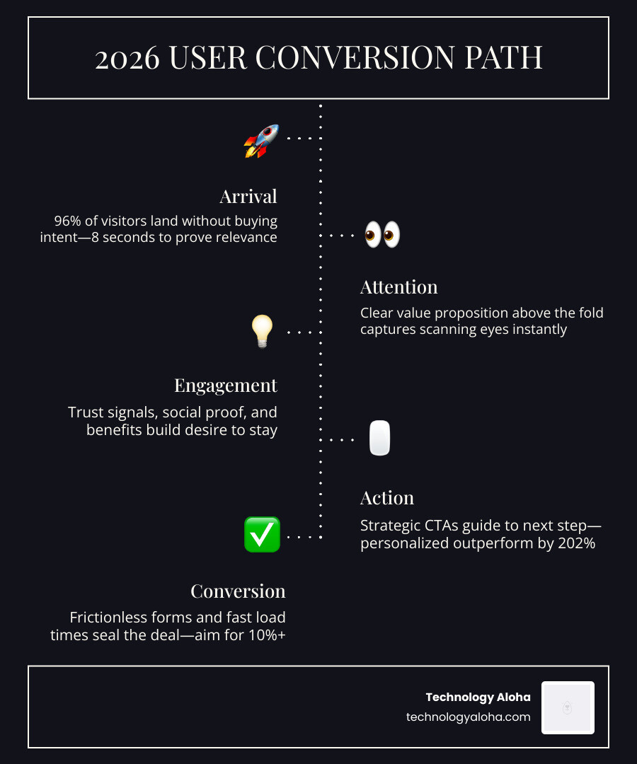
Simple guide to conversion focused websites terms:
The Anatomy of Conversion Focused Websites
A high-performing website is more than a digital brochure; it is your most persistent salesperson. To function effectively, the anatomy of conversion focused websites must prioritize the user’s psychological journey. The value proposition must be the first thing a visitor breathes. If they have to hunt for what you do, they will leave.
Above-the-fold real estate—the area visible without scrolling—is non-negotiable. This space must communicate three things instantly: what you offer, how it makes the visitor’s life better, and what they need to do next. Clarity always wins over cleverness. While “Synergistic Solutions for Global Growth” sounds fancy, “We Help Maui Small Businesses Double Their Leads” gets the click.
Outcome-driven copy focuses on the destination, not just the vehicle. Visitors do not buy software; they buy time saved. They do not buy a lawn service; they buy a weekend free from chores. For a deeper dive into these principles, see The Complete Guide To High Conversion Websites.
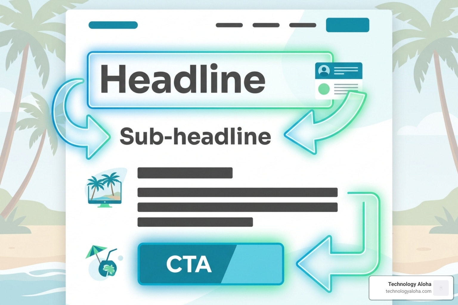
The Role of Copy in Conversion Focused Websites
Copy is the backbone of conversion. In fact, some experts suggest copy accounts for up to 90% of a landing page’s effectiveness. The golden rule is that benefits outweigh features every time. A feature is what your product is; a benefit is what your product does for the customer.
Your Unique Selling Proposition (USP) should be the North Star of your messaging. It identifies why you are the best choice among a sea of competitors. Steve Krug’s classic Don’t Make Me Think emphasizes that users should never have to puzzle over your intent.
Finally, prioritize message matching. If your Google ad promises a “Free 15-Minute Consultation” but your landing page only mentions “Contact Us,” you create cognitive dissonance. The ad promise must meet the landing page reality to maintain trust.
Visual Hierarchy and White Space
Design should act as a silent tour guide. Visual hierarchy uses size, color, and placement to tell the visitor where to look first. We use the AIDA framework—Attention, Interest, Desire, Action—to structure this flow.
Contrast is your most powerful directional tool. A bright #208a9d button on a clean, #4d4d4d background is impossible to miss. Using “containers” or distinct boxes for forms and CTAs makes them pop against the rest of the content.
White space (or negative space) is not “empty” space; it is breathing room that prevents overwhelm. Designing for scanning patterns—specifically the “F” layout for text-heavy pages and the “Z” layout for landing pages—ensures that the most critical information aligns with how the human eye naturally moves across a screen.
Technical Performance: Speed, Mobile, and UX
In 2026, Core Web Vitals are the baseline for success, not the ceiling. Google prioritizes user experience metrics like loading speed, interactivity, and visual stability. The stakes are high: a single 1-second delay in load time can cut conversions by 7%. If your site takes three seconds to load, you have already lost a fifth of your potential revenue.
Friction reduction is the process of removing any obstacle that prevents a user from finishing a task. This could be a confusing menu, a slow-loading image, or a broken link. For professional help auditing these technical hurdles, explore our Web Design Services.
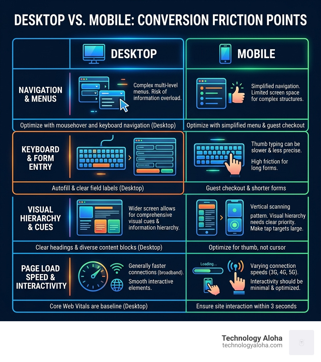
Designing Conversion Focused Websites for Mobile Users
With 83% of all landing page visits happening on mobile devices, “mobile-friendly” is no longer enough. You must design for the thumb, not the cursor. This means buttons must be large enough to tap easily and navigation must be simplified.
Mobile users are often on the go and have even shorter attention spans than desktop users. Implementing guest checkout as a standard for e-commerce and ensuring your site interacts smoothly within three seconds are critical steps. To learn more about this transition, read How To Build A Conversion Focused Web Design That Actually Works.
Reducing Form Friction
Forms are often where conversions go to die. To keep the momentum, consider using natural language forms that feel like a conversation rather than an interrogation.
The death of the CAPTCHA is a welcome trend; these “prove you are human” tests are notorious conversion killers. Removing them or switching to “honeypot” fields can result in a 25–40% lift in submissions. If you require a lot of information, use micro-steps or multi-step forms with progress bars. This signals a finish line and makes the process feel less daunting.
Psychological Triggers and Social Proof
Human beings are hardwired to look to others when making decisions. This is why social proof is the “secret sauce” of conversion focused websites. However, triggers like urgency and scarcity must be used ethically. A countdown banner for a sale that never ends will eventually destroy your brand’s credibility. Use these tools sparingly to highlight genuine deadlines or limited stock.
Trust signals—such as security badges, professional certifications, and clear refund policies—reduce the “fear of the click.” For data-backed insights on implementing these, see How To Build Pages That Convert Using Real Data.

Leveraging Testimonials and Reviews
Testimonials are powerful, but video marketing takes it to the next level. Including a video on a landing page can boost conversions by as much as 80%. Why? Because it is harder to fake a video than a text quote.
When using text reviews, include names, photos, and even star ratings. RubberStamps.net famously saw a 33.20% increase in revenue per visitor just by enlarging the size of their review stars. If you serve other businesses, displaying customer logos acts as industry shorthand for “we are trusted by people you know.”
Action-Oriented CTAs
Your Call to Action (CTA) button is the most important element on the page. Generic phrases like “Submit” or “Click Here” are bland and unhelpful. Personalized CTAs—like “Start My Free Trial” instead of “Sign Up”—perform 202% better.
The color of the button matters less than the contrast. It should “pop” against the background. Use action-oriented language that tells the user exactly what happens next. For a list of high-performing phrases, check out Website Call To Action Buttons The Best And Worst Words To Use.
Testing and Optimization Strategies
The “set it and forget it” era of web design is over. Conversion focused websites require continuous iteration. A/B testing (or split testing) allows you to compare two versions of a page to see which performs better.
Tools like heatmaps and session recordings provide “eyes on the ground,” showing you exactly where users get stuck or where they lose interest. This data-driven approach removes the guesswork from design. As we often say, your opinion of your website is less important than the data your users provide. Learn more about this process in How To Build A Conversion Focused Web Design That Actually Works.
Measuring Success with Industry Benchmarks
What constitutes a “good” conversion rate? While the average sits between 2.9% and 6.6%, “excellent” performance is generally considered 10% or higher. However, these numbers vary by industry. E-commerce averages around 4.2%, while entertainment sites can soar to 12.3%.
Beyond the raw conversion rate, you should track:
- Revenue Per Visitor (RPV): How much each click is worth.
- Customer Acquisition Cost (CAC): How much you spend to get one customer.
- Lifetime Value (LTV): The total profit a customer brings over time.
Data-driven decisions should always trump “gut feelings.” If a test shows a 5% lift, that is a win you can take to the bank.
Frequently Asked Questions about Conversion Focused Design
What is a good conversion rate for my industry in 2026?
In 2026, a “good” rate remains between 2% and 5%, but “excellent” brands are pushing past 10%. For e-commerce, aim for 4%+, and for B2B lead generation, aim for 7%+. If you are in a high-intent niche like emergency plumbing or spring landscaping, you might even see rates as high as 30%.
How does page speed specifically impact my bottom line?
Speed is directly tied to revenue. A 1-second delay can result in a 7% drop in conversions. For a site making $10,000 a month, that is $700 lost every single month just because of a slow server or unoptimized images. In 2026, users expect a page to be interactive within 2 seconds.
Can I balance SEO requirements with conversion goals?
Absolutely. In fact, Google’s current algorithms prioritize user experience (UX). Elements that help conversions—like fast load times, mobile optimization, and clear headers—also help your SEO. The key is to ensure your SEO keywords are woven naturally into your high-converting copy without making it hard to read.
Conclusion
Building a high-performing digital presence requires strategic positioning and data-driven insights. By focusing on the user’s needs, optimizing for mobile, and relentlessly testing your assumptions, you can turn your website into a growth engine.
At Technology Aloha, we specialize in blending cohesive branding with high-conversion designs that work for businesses in Kahului and throughout Hawaii. Your website should be your hardest-working employee—let’s make sure it has the tools to succeed.
Ready to stop guessing and start growing? Explore our Web Design Services today.